Thursday, September 22, 2011

Midterm project - Song Illustration


' Wall in your heart '
The meaning of this song is like a people who got a hurt 
and tried to keep every feelings and everything in their mind.
Which is others people cannot know the actual feeling.

I use a square to represents a wall which it look quite strong.
For the color, I use a dark tone color (Black, Grey,Violet & Navy Blue)
to represent the feelings of sorrow and hurt.
And the reason why I mixed it together is 
I want a paintbrush's strokes make a feeling of confuse.

If you have any comment or suggestion, feel free to tell me :D
thanks in advance !

Friday, September 16, 2011

A song for Midterm Project


' Wall In Your Heart by Shelby Lynne '

. . .

I feel your pain, I feel the rain
What happened to you
I can't get to you

* (Cause/But) there's a wall in your heart
That no one can get through
And it's cold and it's dark
And you don't have a clue

** But this wall it will fall
If it's the last thing I do
I'll get through this wall in your heart

I know your soul, I know I'm home
Just come here to me
I'll let you run through me

[Repeat * , **]

We'll break down all the troubles we have found
And I'll find a way to mend your broken pieces
We'll hold hands and be friends til the end
And our love will be forever

[Repeat * , * , **]


Thursday, September 15, 2011

3rd week : An abstract painting from given word

 
( from the top left to the bottom right )
magic, fresh, spicy, grow,sorrow, danger, pure, love, exite, luxury

' This assignment is so hard for me TT_TT
It is hard to make a people understand what you want to say
by use only shape and color.
Anyway, it is still the fun class :D '

If you have any suggestion, please tell me ^^"
thanks !

Saturday, September 10, 2011

2nd week : The illustration influenced by my favorite illustrator


" This picture got the inspiration from the work of Jiranarong Wongsoontorn.
The characteristic of his work is using ink pen, warm color and sense of childhood.
I tried to bring the these main point to adapt with my art style.
And the outcome is this picture !

The picture of a child in a Japanese kindergarten uniform. :3
The uniform may not same as the real one exactly, 
but I think the people can guess what it is. 
I tried to use warm and light color to give a feeling of innocent and comfortable. "

. . .

If you read until this line
Don't you interest to leave some comment for me ?
t h a n k s . i n . a d v a n c e : )


Friday, September 2, 2011

1st week : Self Portrait


Not much to say about this work. hehehe
I tried to drew it with five characteristics of mine which is
' short hair '
' always ware a cardigan '
' silence '
' funny '
' always use this kind of bag '
But finally the picture is not look like me so much (lol).
Anyway, it is a good experience because I never try to draw myself before. :D

Thursday, September 1, 2011

Type of Illustration : Editorial Illustration

Editorial Illustration is a kind of illustration that use to support an editorial article in plublication.  Moreover it could be an illustration of anything, just specific to the article it references. The artist have to make the understanding of those article and try to emphasized the core of the topic. After that, illustrate it clearly to the readers. I always got the inspiration from illustration of Jiranarong Wongsoontorn. His illustration give a felling of relief and nostalgia. When I look at it, it recall me to the childhood. He use a japanese brushes or a pen draw it in black color or make a computer graphics.


“ Working...”
This work he use a japanese brushes technique
 play with a pen and earphone.
The color of this picture give a feelings of quite
which quite oppose with the picture that look impient.
I think it is a great combination of composition and colors.

. . .

 “ Me and Moon hugger :) ”
This is a combination of computer graphics and a picture.
In my opinion, both of it blend harmonious together.
He use yellow to refer to the moon
and use turquoise to express the feeling of desolation.
He also add the glow to make it more realistic
like a star shine in the sky.

. . .

 Photobucket
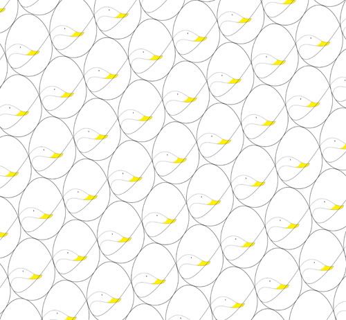
“ Duck's circuit calendar ”
He illlustrate the circuit of the duck as the name of this work.
In picture you will see a white duck with the oval.
He draw a curve line which we can see it as a duck's neck
or the crack of the egg.
I like how he illustrate it simply.

. . .

 Photobucket
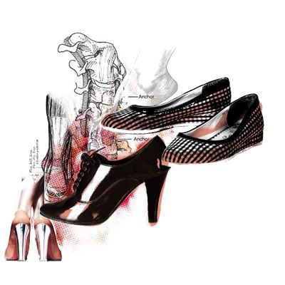
“ Pain is foot ”
This is another great combination
of drawing, computer graphic and real image.
He use red and black colours
to express the feeling of pain when we wear a shoes.
Besides from the shoes, he also add the picture of bone
which make the reader see it obviously.
. . .